death wish coffee
THE BRieF
At its core, the project explores the experience of drinking coffee itself—rich flavors, strong energy, and that unmistakable feeling that keeps people coming back for another cup.
THE PROCESS
The biggest challenge was balancing the intensity of the name with the everyday experience of coffee. “Death Wish” immediately suggests something dramatic and dark, but the brand is also about flavor, ritual, and the small moment of finishing a great cup.That contrast shaped the concept. Instead of focusing only on the idea of death, the design leaned into the aftermath of the coffee itself—the moment when the cup is empty and only the stain remains.

THE SOLUTION
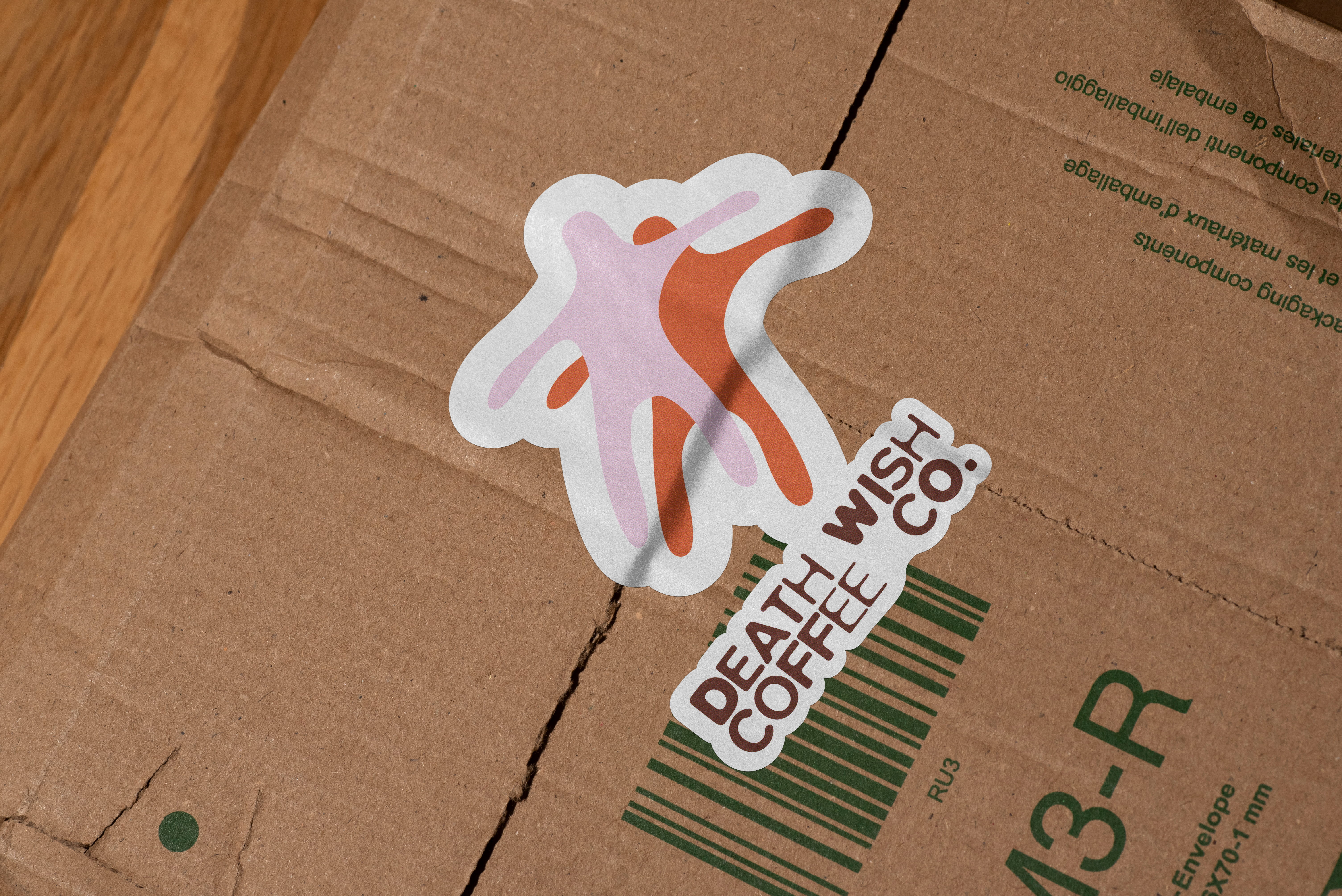
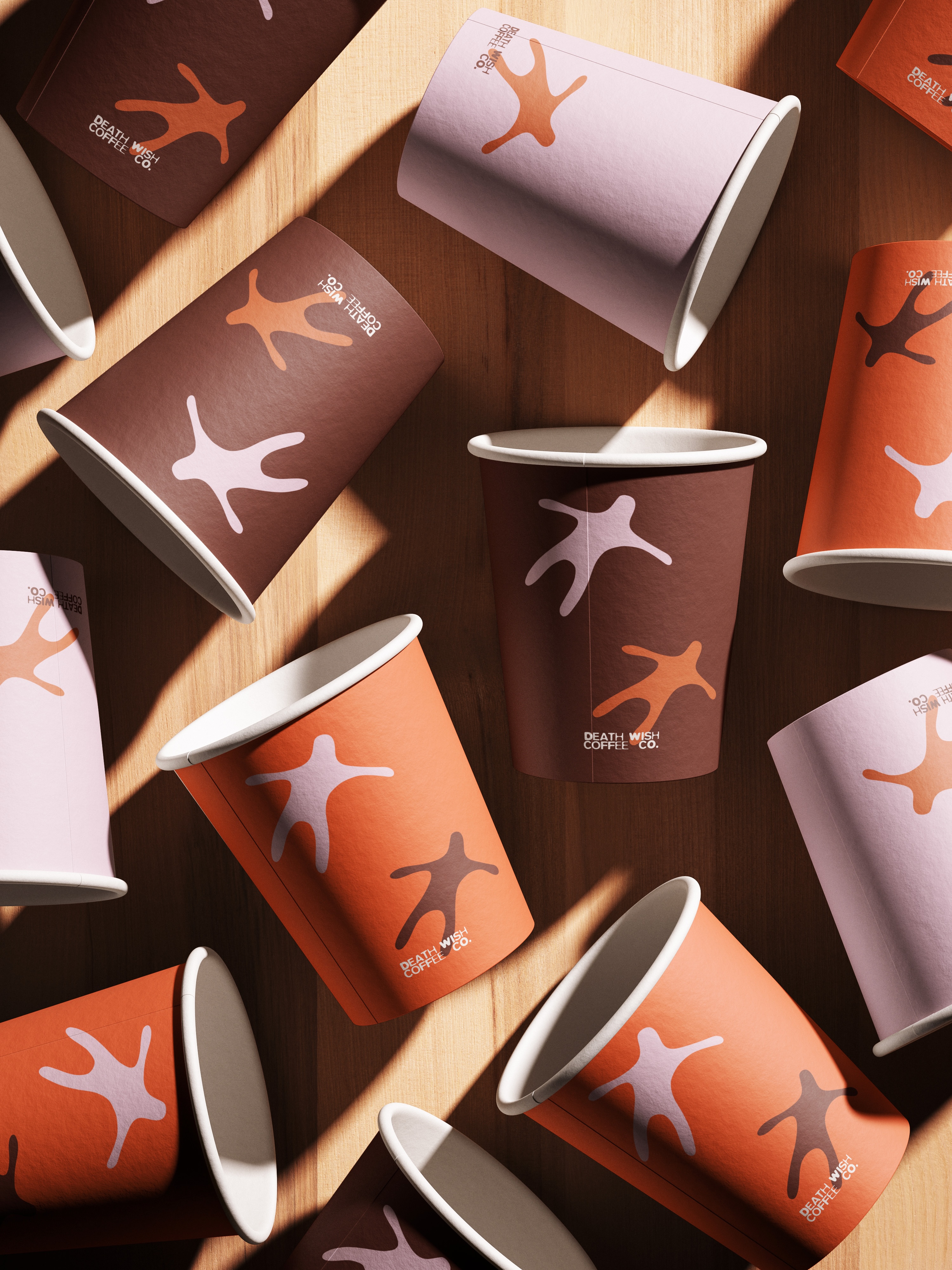
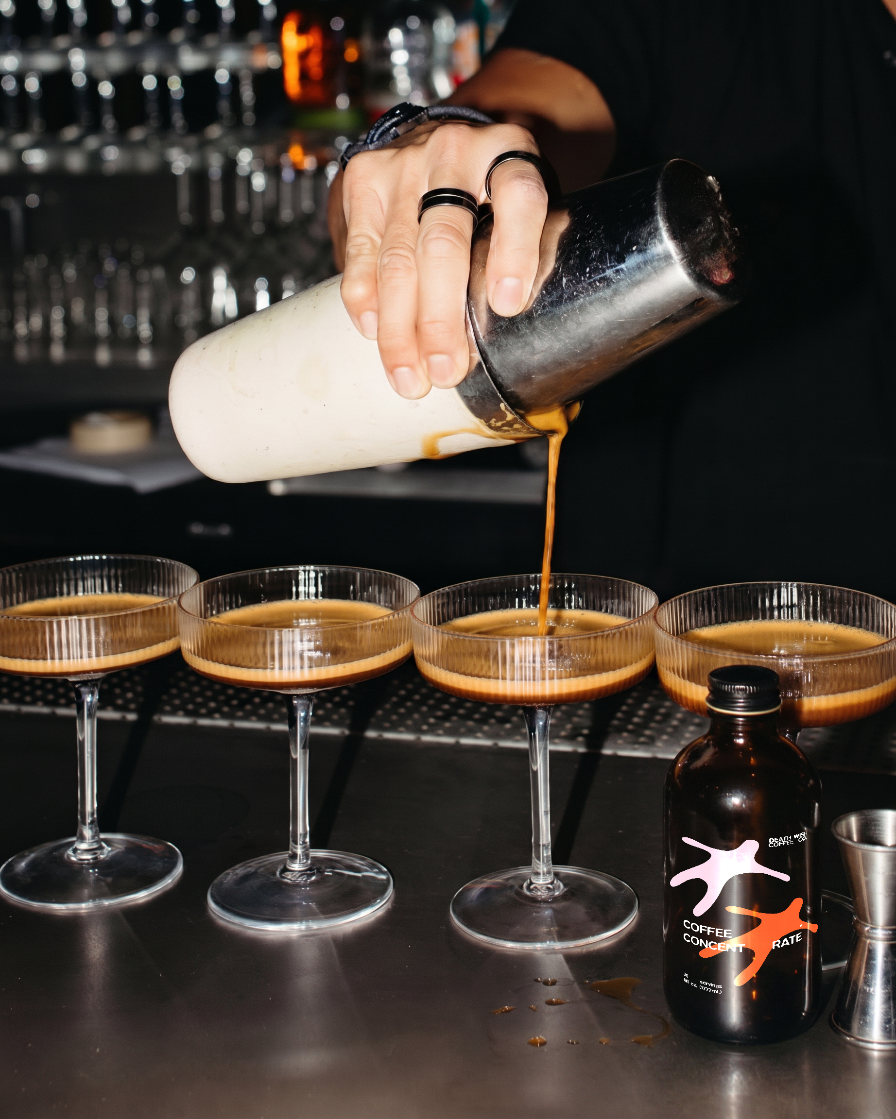
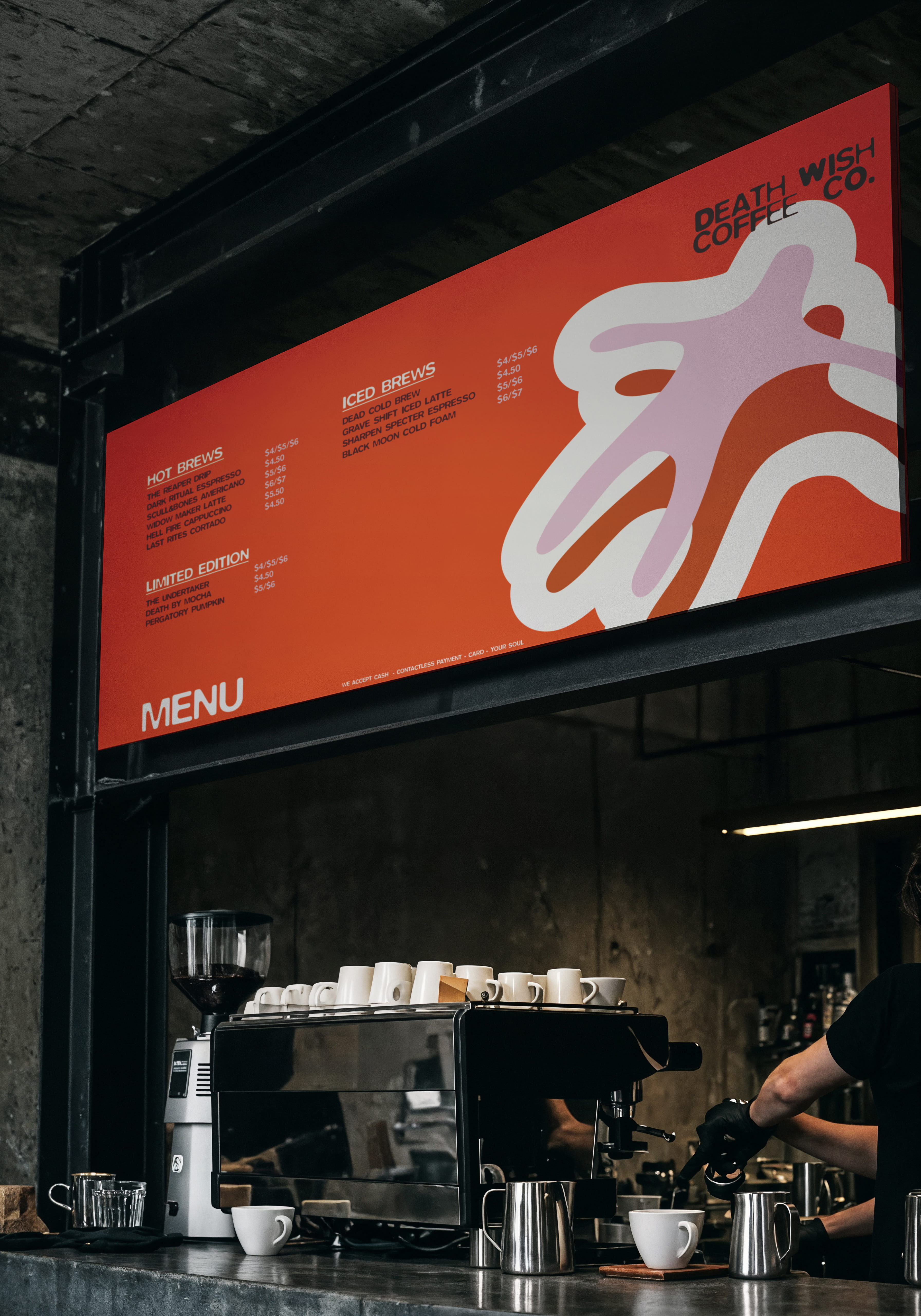
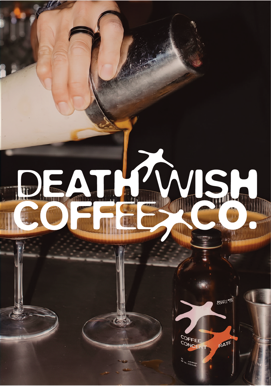
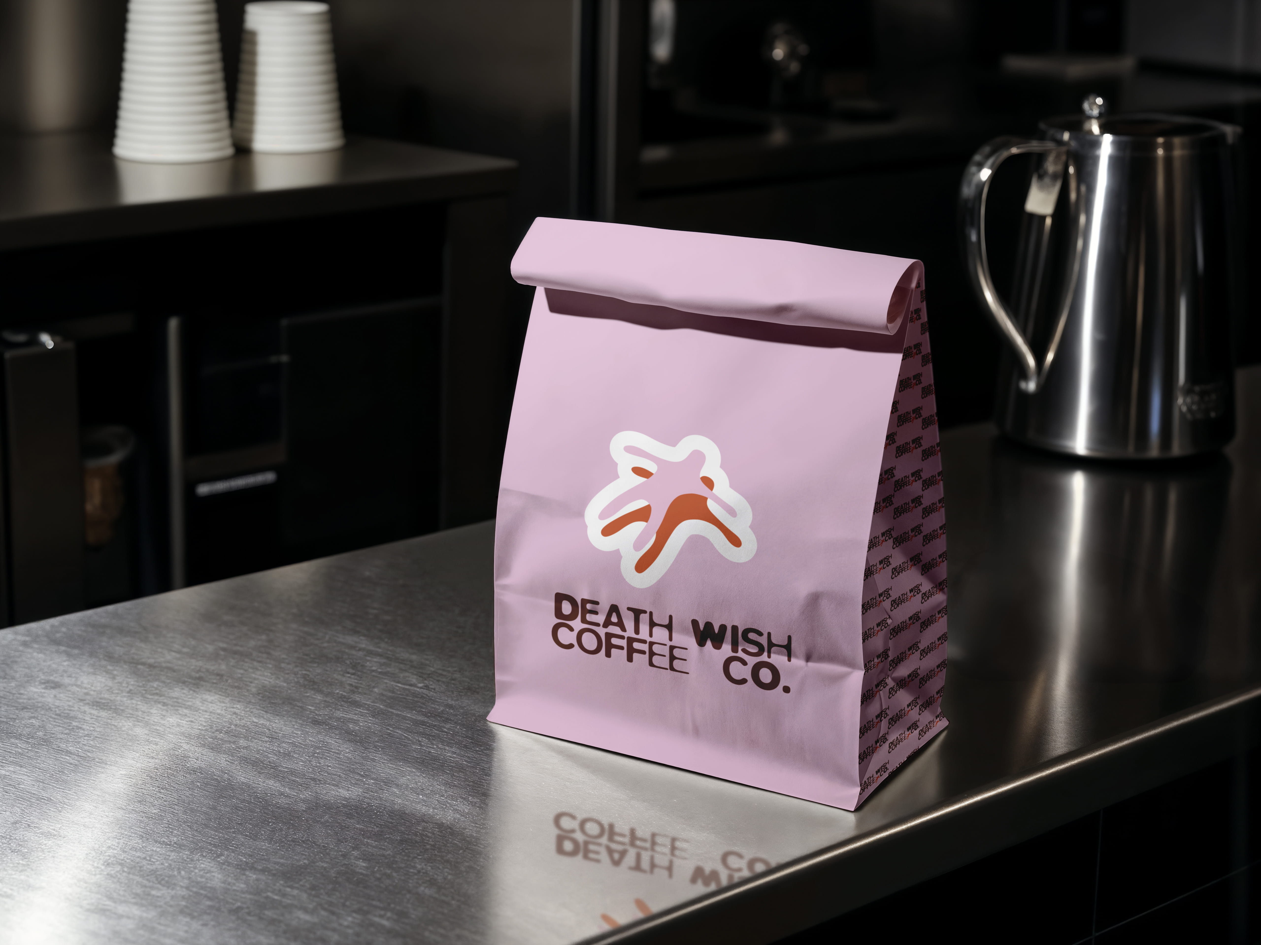
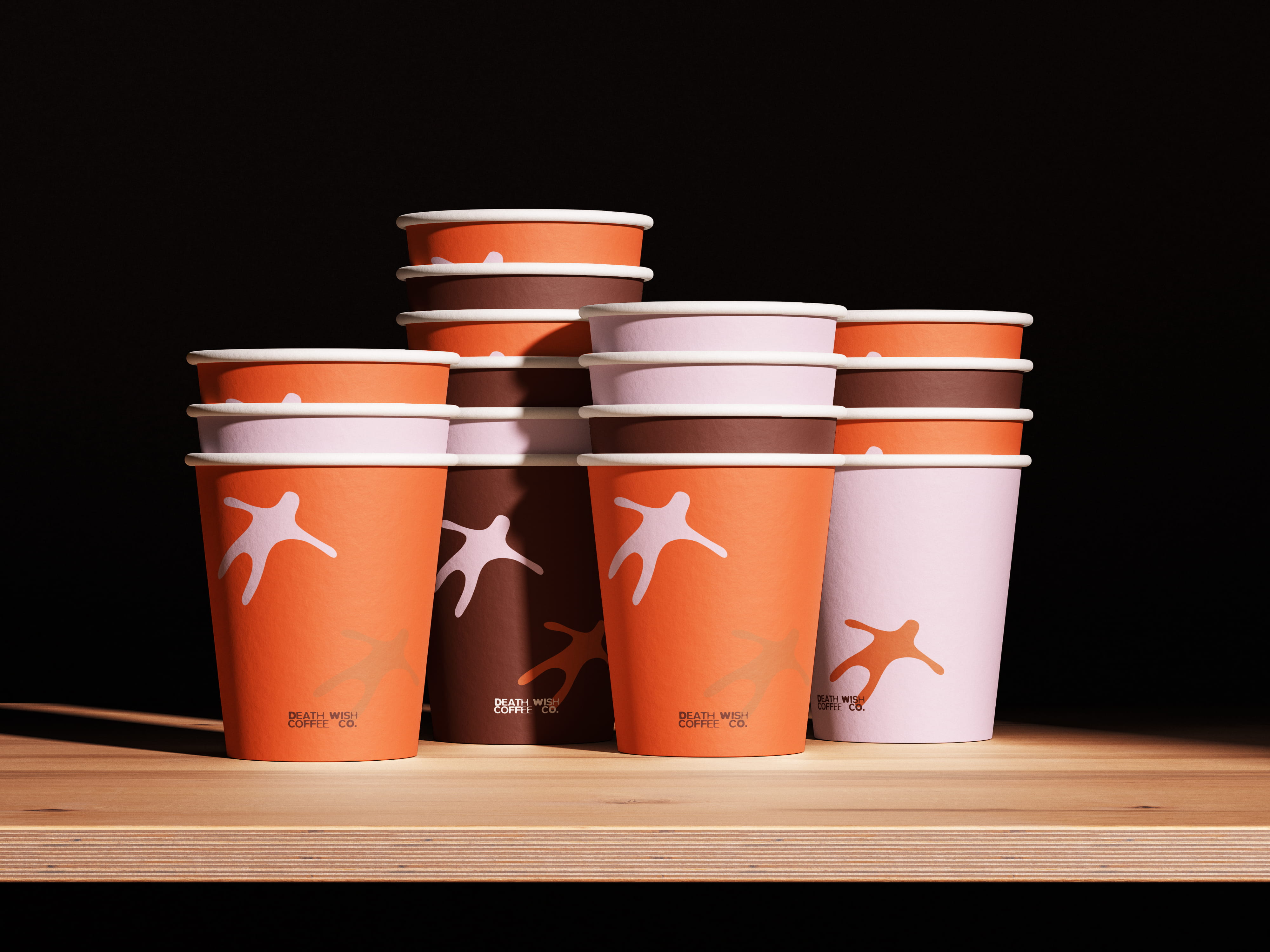
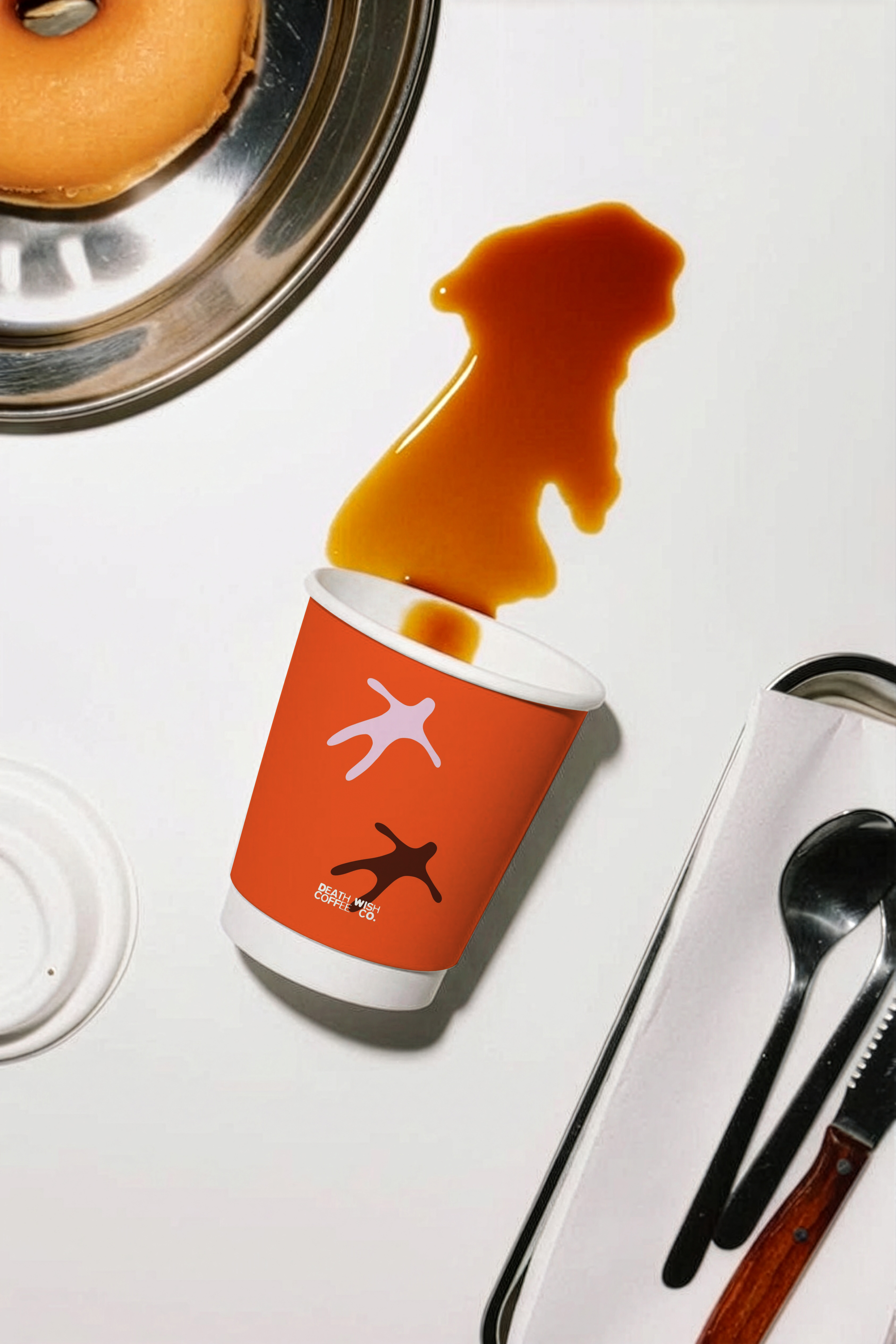
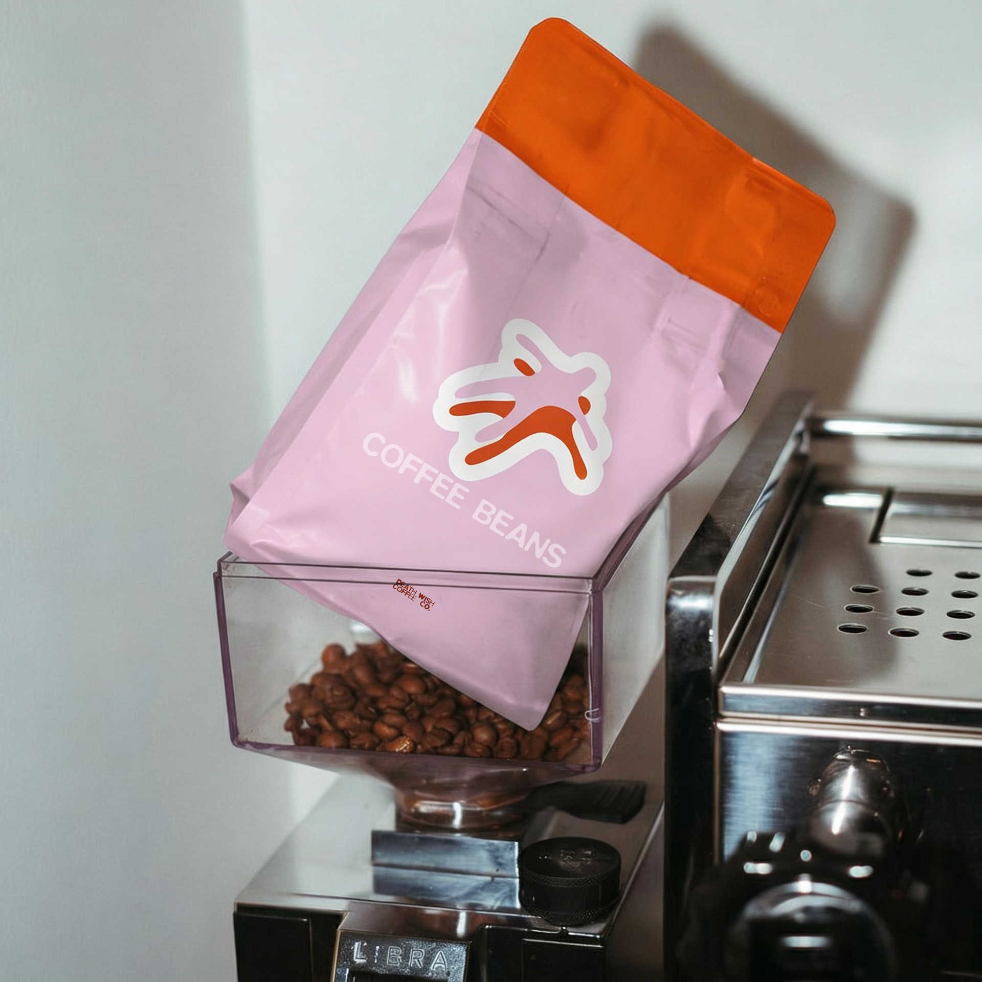
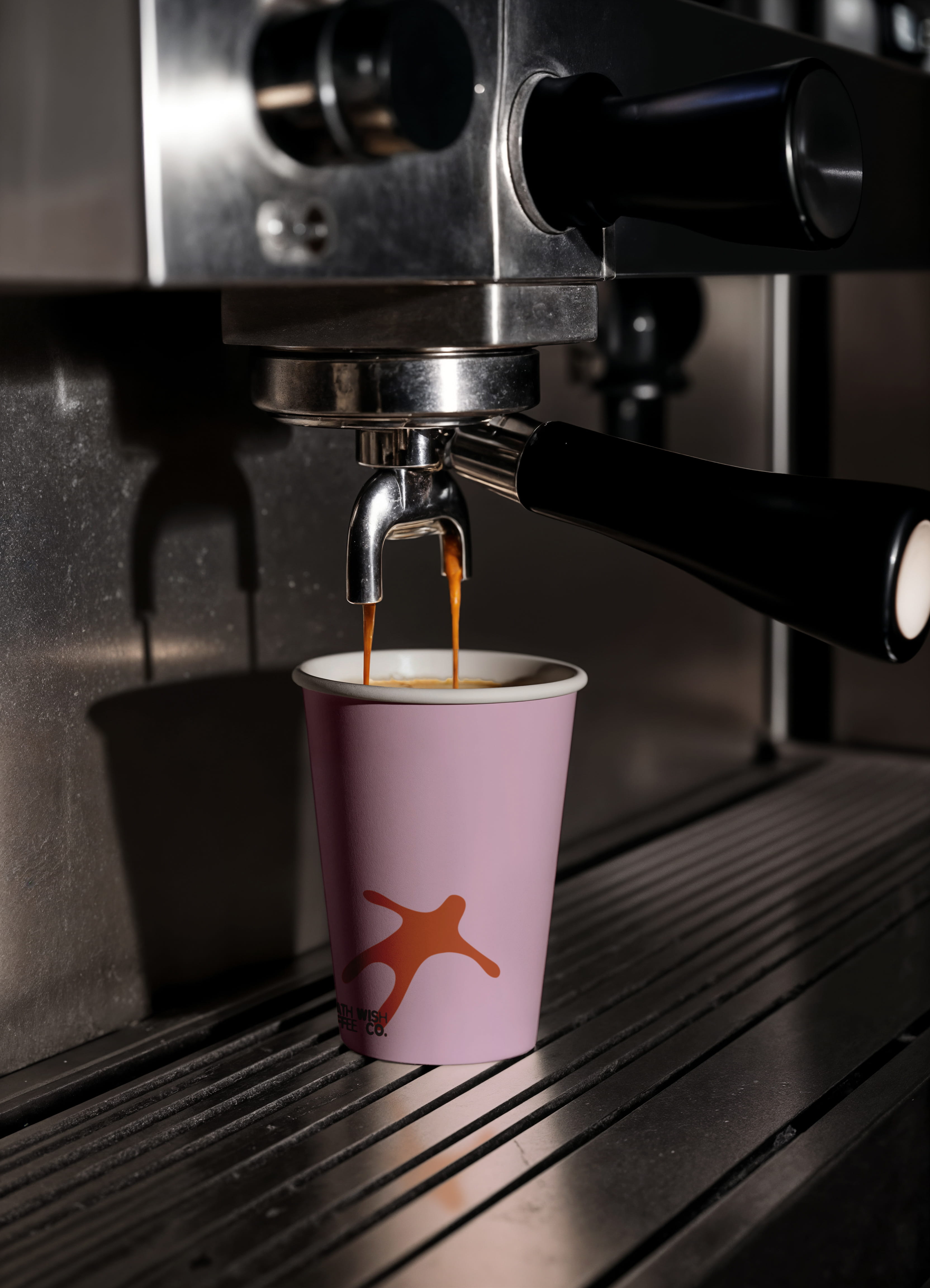
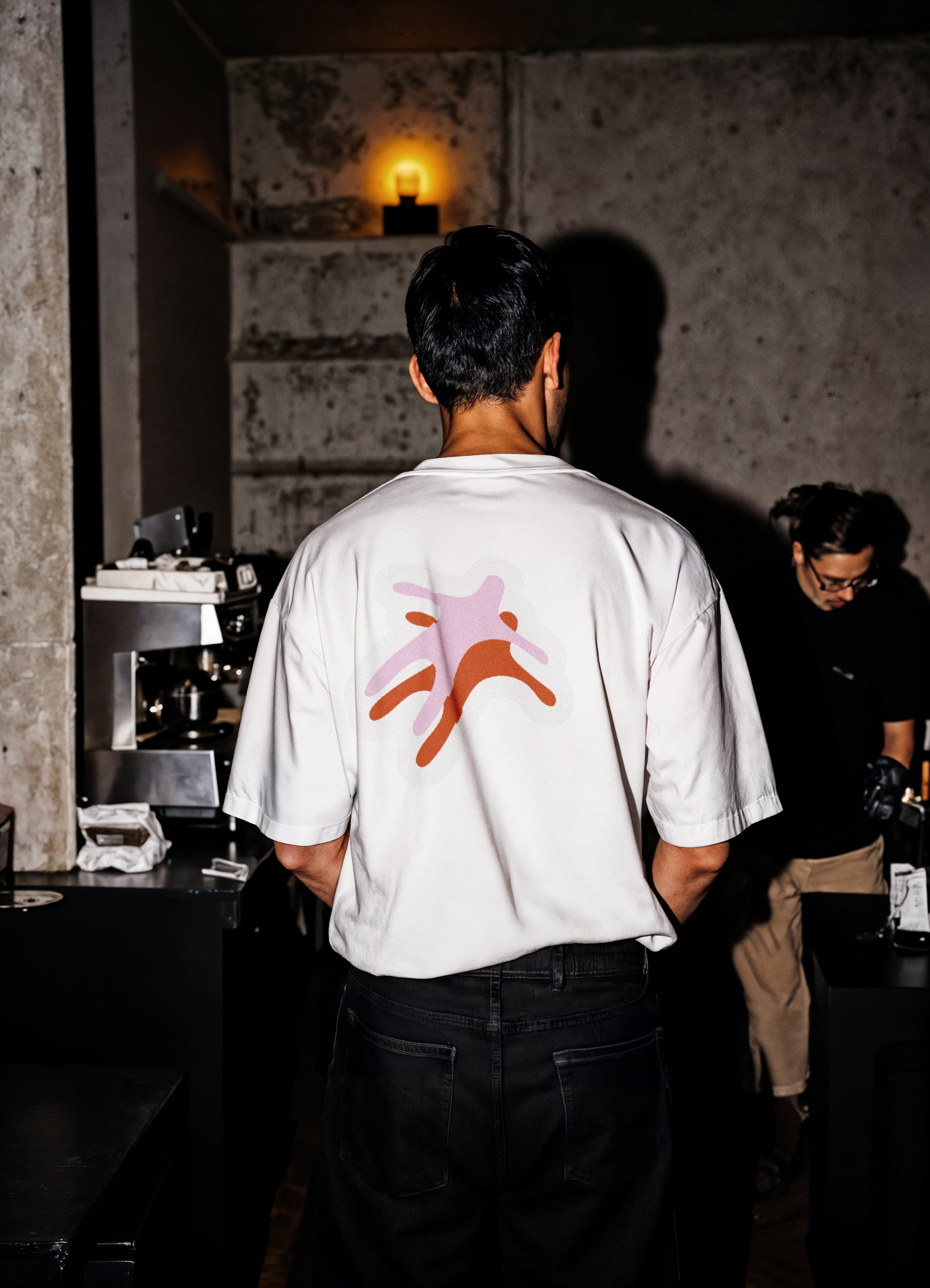
The identity centers around a logo inspired by a coffee stain—suggesting a cup that has just been finished, leaving only its mark behind. This simple gesture reflects the idea that the coffee was so rich and satisfying that nothing remains. To add personality, a small character was introduced, subtly implying a soul leaving the body—a playful nod to the powerful, almost out-of-body experience that a strong cup of coffee can create.
Color became another key part of the system. Instead of relying on a single tone, the palette expands into a wide range of vibrant colors, reflecting how every person experiences coffee differently depending on their mood, energy, and moment in the day.
Together, the coffee stain, character, and flexible color palette create a simplified yet expressive identity. The system adapts easily across packaging, coffee shop environments, and promotional materials while capturing the bold, memorable spirit of Death Wish Coffee.