mpm Kombucha
THE BRIEF
Marchés publics de Montréal turns every visit to one of their markets a celebration, where Montréal comes together to enjoy amazing local farmers, creative food artisans, and mouthwatering fresh produce in lively community hubs.
Kombucha is that fizzy, fermented tea with ancient East Asian origins that feels as good as it tastes. Its lively tang and natural probiotics support your gut, while antioxidants give you a refreshing boost—like a cheerful pick-me-up in every glass.
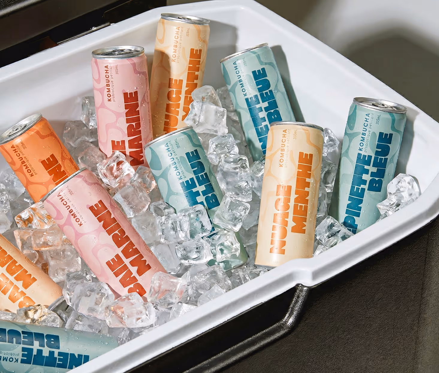
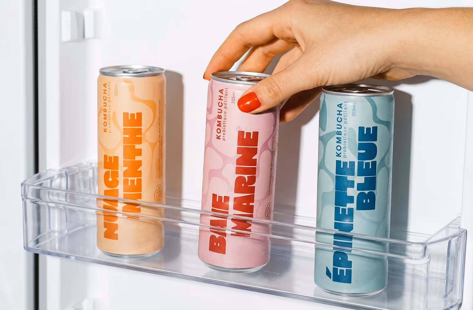
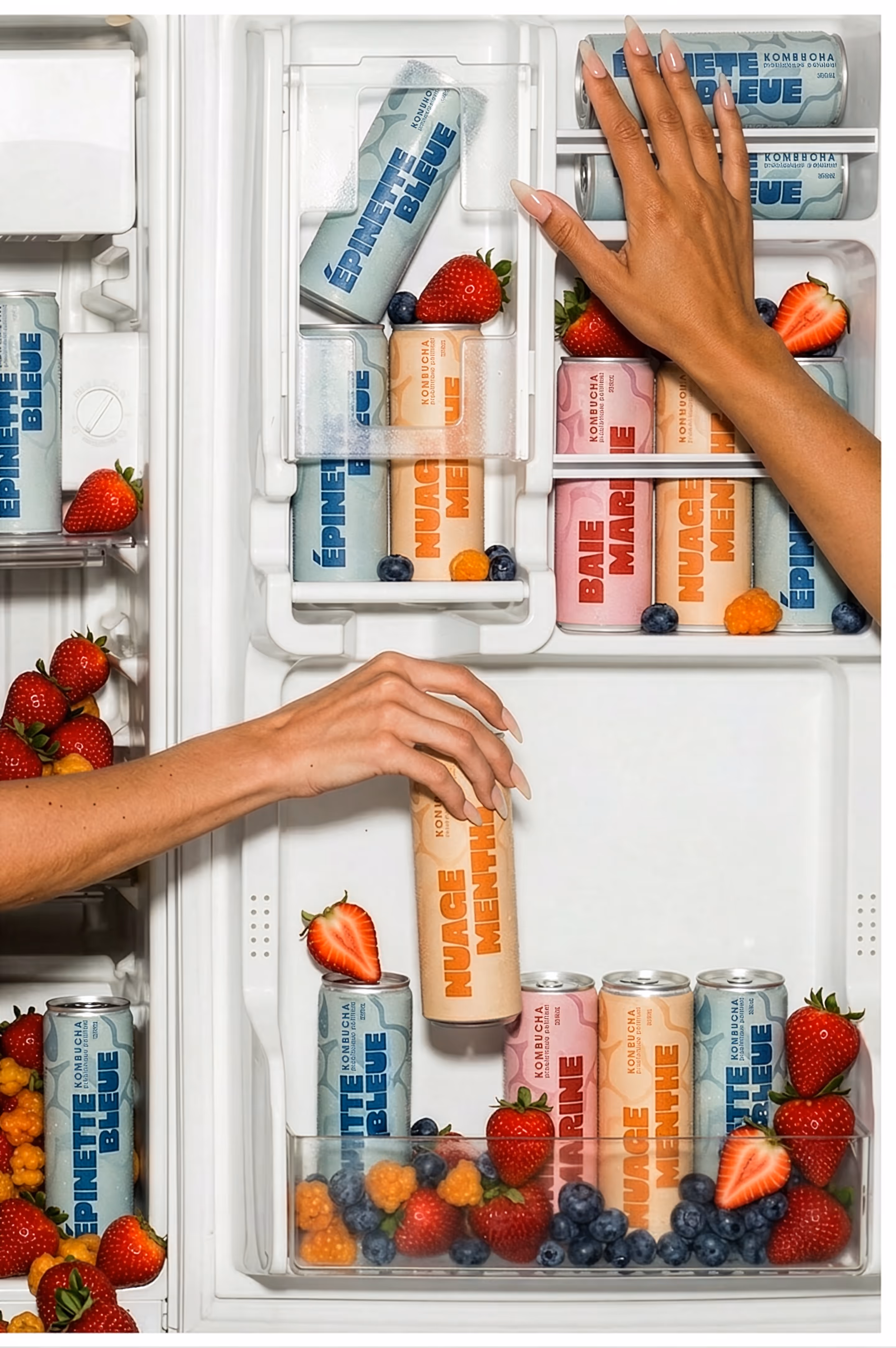
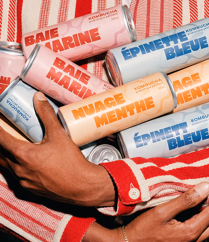
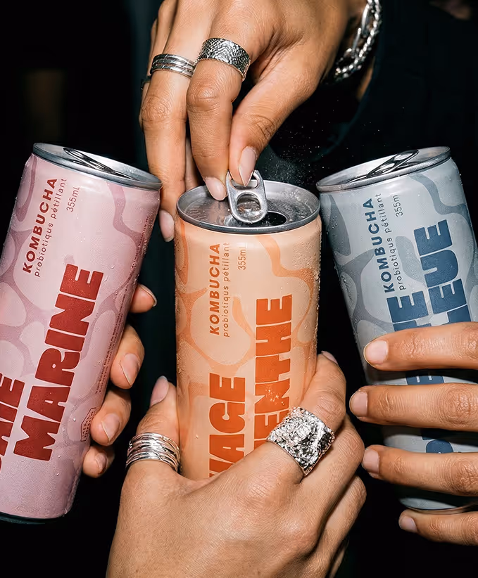
At its heart, this project celebrates community and creativity, building a vibrant visual world for a kombucha brand created for the Marché Public. The trio of flavors features ingredients cultivated and locally sourced in Québec, bringing local spirit to every sip. Together, the three cans offer a bright, welcoming introduction to kombucha—fresh, lively, and crafted with care.
the process
The goal was simple: to show that kombucha can be just as fun and satisfying as your favorite soda, while offering a brighter, better-for-you alternative. Inspired by its probiotic goodness, the design naturally evolved toward vibrant colors and energetic iterations that celebrate the drink’s lively personality.
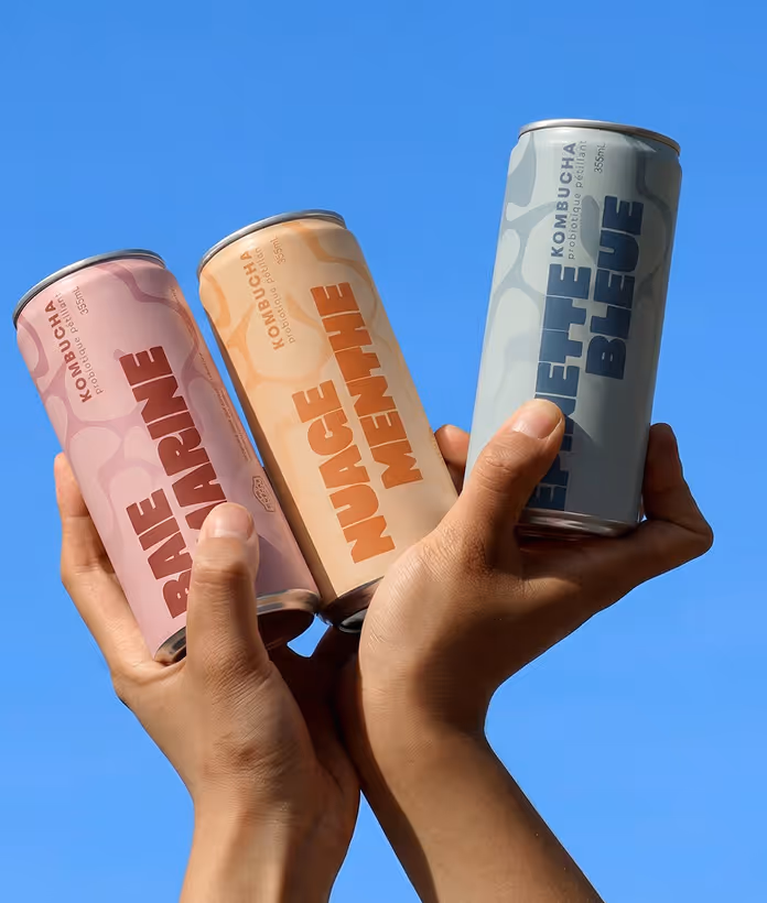
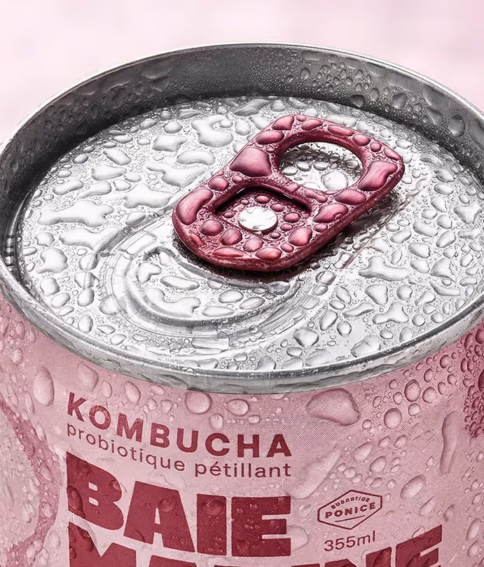
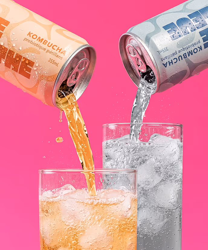
Illustration was part of the early exploration, but the graphic direction ultimately felt the most dynamic and eye-catching. Abstract shapes ripple across the surface, echoing the magic of fermentation and that signature fizzy sparkle in every sip. Each flavor carries its own distinct voice through color—carefully balanced to stand out while still feeling part of a cohesive, spirited family.
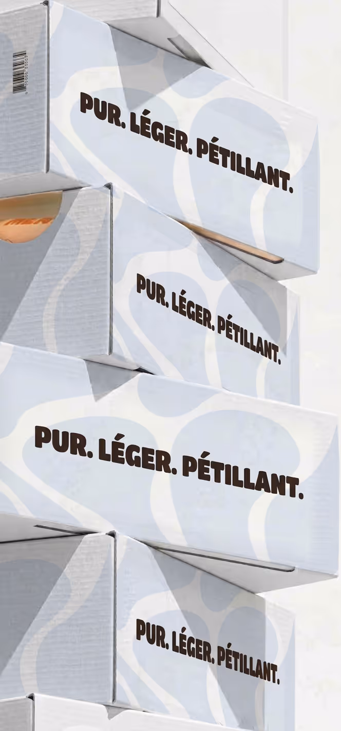
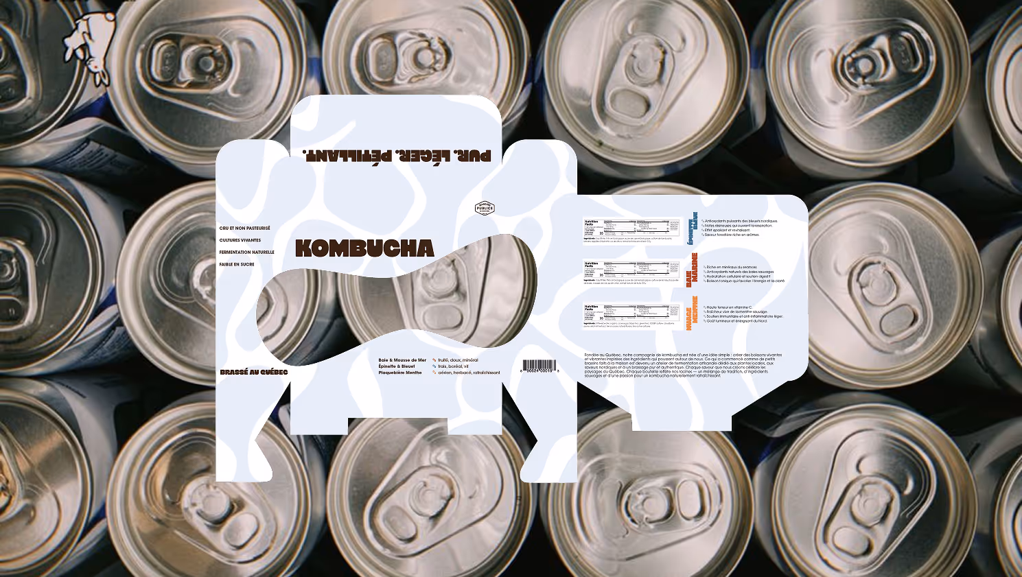
The box set brought its own creative adventure. Visually and typographically, it became a puzzle worth solving: how to complement the vibrant cans without competing with them. Through experimenting with structure, form, and display, the final design holds everything together beautifully—showcasing each can equally while still delivering a bold, shelf-catching presence.
the solution
Big, bold typography sets the tone with instant energy and warmth. It feels confident yet welcoming—inviting you in with the same sparkle as the drink itself. The vivid cans radiate personality, offering a cheerful, feel-good alternative to soda that doesn’t just taste refreshing, but delivers real benefits too. Eye-catching colors draw you closer, while proudly celebrating local production in Québec and ingredients sourced close to home.
A soft powder blue backdrop paired with rich dark brown type ties the whole story together, creating a calm stage where the vibrant cans can truly shine. The Diecut on the front echoes the playful patterns featured on the cans, giving the box an unexpected twist—transforming what could have been an ordinary package into something bold, distinctive, and full of character.